Movie posters analyzed
A while ago, we stumbled upon this interesting article about movie poster clichés by Business Insider, so we decided to put the posters for some of our placements to the test!
Let’s have a look…

“This one frames the face very clearly, placing a wall of text over a close-up of the main character.”
This style certainly seems popular within our list of films and series. Interestingly, all of them use similar blueish hues as well as an abundance of shadows, despite the varied subjects: ‘Blinded by the Lights’ (for which we worked on the trailer) is a crime series about a cocaine dealer, whereas ‘Festung’ deals with family issues and coming-of-age, and ‘Adieu Paris’ is about a mistress and her lover being in a coma.
…Maybe it indicates drama?
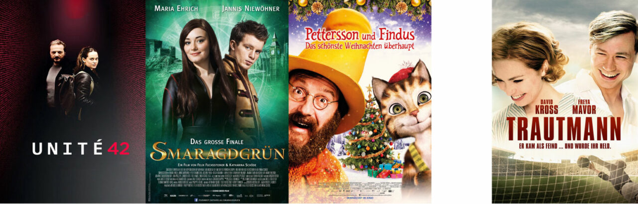
On the posters for ‘Unité 42’, ‘Smaragdgrün’ and Petersson and Findus’ Christmas movie, we see the classic ‘back to back’ and ‘side to side’ approach, popular across several genres of movies and series. Many stories feature an iconic duo, making this the ideal trope for their promotion material.
As for the poster of the movie ‘Trautmann’ (internationally known as ‘The Keeper’), it would not stand out in a list of cliché movie posters for romantic comedies.
For this genre we often see a couple embracing each other on a beach, with an image of their heads floating above them. Even without the beach setting, the floating heads are definitely a well-exploited part of movie posters (think of ‘Titanic’, ‘Casablanca’, ‘Gone with the wind’ etc.).
And who needs a beach when you have a football pitch?
Same same, but different.
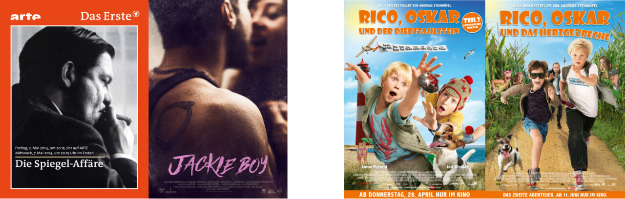
‘Die Spiegel-Affäre’ and ‘ Jackie Boy’ show us their main character as the ‘badass from behind’, clearly indicating both of them to be action movies.
Meanwhile, Rico and Oscar hint at the same genre -albeit aimed at a different age category – by running on their posters.
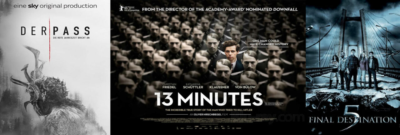
The subtitle of ‘Der Pass’ announces that ‘the red season is about to start’, hence the red stripe against a rather grey backdrop. On the poster for ’13 minutes’ (based on facts about world war II) the highlighted person is Elser: someone who could have changed world history.
These movies/series use a lack of colour in their posters to give you that ominous vibe that fits these three stories so well. Note how both ‘Der Pass’ (also known as ‘Pagan Peak’) and ’13 minutes’ (also known as ‘Elser’) highlight one colour in contrast to the rest of their poster, emphasising one element that will be key in their storylines.
Curious about the films and series we worked on the music for?
Find out more here.